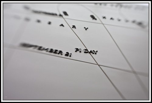
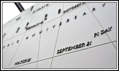
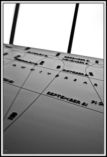
The topic is so interesting that I feel cheated to see it not all in focus. Your composition, especially in the third photo is enough to keep things structured, but I want to look deeper into the text and lines and see what it's all about.
That's my only nitpick as well; It's all out of context. I think you're overplaying the artsy side of things with this one. Sometimes, you just want to see the thing.
They're very interesting photos otherwise, and very well lit.
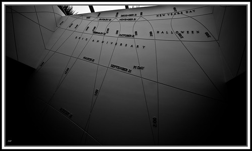
The large version of the last picture lets you see the whole wall. I just felt it too big to make a regular picture out of; there's a lot of it, and then just walls. I wanted to pick somewhere inside it to expose that it was a timepiece, and then just fade away, giving a feeling of expanse to give you an idea of the size.
Also attached are the two unedited photos I used to construct this one (it was not possible to actually take a photo with no people in front of the clock.) Originally, I was going to submit this shopped photo to the challenge, but I ended up liking more the shot I took as an afterthought when walking away.
Snark and CB - you found awesome subjects! Where are they located?
Zanthian - great colors. I'd love to have an alarm clock like that. Did you have to change any settings on the camera to get the motion blur the way you wanted?
Marushka's cracked me up - I was focusing on reading the clock, and didn't even notice what it was floating over for a few seconds.
Mine is supposed to be the things I haven't had any time for recently. Somewhat fittingly, I didn't have enough time in post to get mine exactly how I wanted, and I also got a few details wrong when taking the photos because I was in a hurry.
I prefer the B&W version because it hides the wildly different lighting situation for each photo. In the color version I posted, I desaturated red and yellow to tone down the gold glow from the wood floor that the Playstation is just above, and also desaturated a little green and cyan to make the controller pop a bit less. It helps, but not enough for me to feel comfortable with the color version. Still, I've been wanting to do a triptych, so I'm glad I gave it a shot. I'll probably do another sometime.
CB's subject is a clock made of vegetation, located in Kings Island amusement park.
I'm really not satisfied with my photo for today. After taking shots of several different timepieces, I settled on my trusty Skagen, which I could keep in one place to model for me. I still didn't get the light correct, as you can see by the highway stripe looking reflection on the mineral glass.
However, one thing I did want to capture and did succeed with, barely, is the passage of fifteen seconds across the face of the watch. This signifies that although the watch has never let me down, and even saved me from a broken wrist once, the second hand always makes its presence known. It's the loudest ticking wristwatch I've ever had.
Prime - I like it, though I don't know if the phone needs to be in there. The anachronism isn't strong enough to turn it from looking out of place to looking like it's purposeful, to me. Shadows on the far side are a little strong, but lighting, color, and focus all good.
Mert - Clever shot, but I think it'd be better with some bounce flash rather than what looks like straight forward flash. Glad to have you in the challenge!
GH - It's pretty yellow. Is that the real color of your brick and grout, or was that just the lighting? I like the one in this thread more, honestly, reflection be damned. The detail in the tip of the second hand and in the watch edge are excellent.
The color in the Skagen pic is probably a mistake. I really need to figure out why things don't look the same on my monitor as they do for other people. I think that my monitor must be desaturating images. Any suggestions for color correction software for the monitor?
In reality, the brick is rather brownish and the grout should be grayish.
//edit: I just edited the colors in flickr's editing software, let me know if that looks any more realistic... it does on my monitor, a little. But that's just my monitor.
The rest of the shots from my 'Watchmaker' series:
I shot these in 2005 on a Nikon D70. The whitebalance is a little meh in some of them (the last two shots used flash, which destroyed the color. I just love the expression) I did some post on the 2nd picture, bringing it into a battle of cool and warm colors, but I decided to post the original.
Mert - Clever shot, but I think it'd be better with some bounce flash rather than what looks like straight forward flash. Glad to have you in the challenge!
Yeah, it was the flash that's built into the camera, and my experience is pretty limited. I had to get an explanation of "bounce flash" from my wife (who I am trying to get involved in this challenge). Also my first Adobe Lightroom experience (she helped with that as well).
Snark - I really like your shots. both the one in the results thread and the above ones. I keep waffling on if i like the background looking 'white'.
CB - very cool subject, very nice colors!
Marushka - it is wednesday, after all.
zanthian - very cool. i'm impressed that you managed to get almost completely linear blur. it has a really cool effect.
garg - i think the wide variety of the backgrounds really distracts me from the watch
prime - i had a similar idea. very good job of getting the watch in focus. i think i would have liked it a little more if the g1 were more out of focus.
mertesn - like has been mentioned, a little less direct flash would have been great. Also, i'm a bit distracted by the writing on the left-hand side of the pic.
gh - looks much better with the corrected white balance. you might look at loading the color profile for your monitor into windows. I think i like the one in this thread better too. what's the reflection in the one in the results thread?
Lynx - I think i'd like this better if either both the watchmaker and the watch were in focus, or just the watch.
GH - much better after the correction. It's still a little yellow, but it's a much more believable yellow.
Lynx - great shots. I like the second the most, because of the fantastic gearing in the watch, but the last one also would have been wonderful if the watch were in focus rather than the tip of his nose. Still, very nice shots. Take your current one and throw it up in the thread soon!
Marushka's pic turns me on. I guess that's all I have to say about that.
Zanthian: I love it. If you had cropped it slightly to be perfectly horizontal, it would be perfectly awesome. GREAT photo, and I want to know how you did it
Garg: Dude, I LOVE the concept! Absolutely awesome triptych.
Mert: Welcome to the project! Can't go wrong with cats. Try to be conscious of your background in your shots, it's slightly distracting
GH: Awesome photo, period. I love it.
Lynx: Amazing photo, full of character; I can tell from the photos that you adore the man, and that's BEFORE I knew it was your grandfather. Great job.
Prime,
Since I am new to this, it took trial and error. I placed the alarm and the camera on a table in a dark room. Next I set the camera to a longer exposure time. Then I clicked to take the picture, moving the focal point slightly and then resting on the numbers again so they would be clear. I took maybe 10 shots trying to get the numbers still visible. I was happiest with this shot because it was so linear and the numbers were clear.
Also, your picture makes me crave a zoomed in shot on those gears of the watch.
Jimmah: Welcome to the project! What camera did you get? That's a great entrance to the challenge - well composed, well lit, interesting subject. Good work


Comments
They're very interesting photos otherwise, and very well lit.
Apparently not done so well. :/
Also attached are the two unedited photos I used to construct this one (it was not possible to actually take a photo with no people in front of the clock.) Originally, I was going to submit this shopped photo to the challenge, but I ended up liking more the shot I took as an afterthought when walking away.
Zanthian - great colors. I'd love to have an alarm clock like that. Did you have to change any settings on the camera to get the motion blur the way you wanted?
Marushka's cracked me up - I was focusing on reading the clock, and didn't even notice what it was floating over for a few seconds.
Mine is supposed to be the things I haven't had any time for recently. Somewhat fittingly, I didn't have enough time in post to get mine exactly how I wanted, and I also got a few details wrong when taking the photos because I was in a hurry.
I prefer the B&W version because it hides the wildly different lighting situation for each photo. In the color version I posted, I desaturated red and yellow to tone down the gold glow from the wood floor that the Playstation is just above, and also desaturated a little green and cyan to make the controller pop a bit less. It helps, but not enough for me to feel comfortable with the color version. Still, I've been wanting to do a triptych, so I'm glad I gave it a shot. I'll probably do another sometime.
I'm really not satisfied with my photo for today. After taking shots of several different timepieces, I settled on my trusty Skagen, which I could keep in one place to model for me. I still didn't get the light correct, as you can see by the highway stripe looking reflection on the mineral glass.
However, one thing I did want to capture and did succeed with, barely, is the passage of fifteen seconds across the face of the watch. This signifies that although the watch has never let me down, and even saved me from a broken wrist once, the second hand always makes its presence known. It's the loudest ticking wristwatch I've ever had.
Here's a previous crappy attempt with another timepiece. Notice my camera's lens reflection in the glass:
<a href="http://www.flickr.com/photos/ghoosdum/3748255420/" title="do not want by ghoosdum, on Flickr"><img src="http://farm4.static.flickr.com/3462/3748255420_d36963f584.jpg" width="500" height="375" alt="do not want" /></a>
Prime - I like it, though I don't know if the phone needs to be in there. The anachronism isn't strong enough to turn it from looking out of place to looking like it's purposeful, to me. Shadows on the far side are a little strong, but lighting, color, and focus all good.
Mert - Clever shot, but I think it'd be better with some bounce flash rather than what looks like straight forward flash. Glad to have you in the challenge!
GH - It's pretty yellow. Is that the real color of your brick and grout, or was that just the lighting? I like the one in this thread more, honestly, reflection be damned. The detail in the tip of the second hand and in the watch edge are excellent.
In reality, the brick is rather brownish and the grout should be grayish.
//edit: I just edited the colors in flickr's editing software, let me know if that looks any more realistic... it does on my monitor, a little. But that's just my monitor.
I shot these in 2005 on a Nikon D70. The whitebalance is a little meh in some of them (the last two shots used flash, which destroyed the color. I just love the expression) I did some post on the 2nd picture, bringing it into a battle of cool and warm colors, but I decided to post the original.
<table style="width: auto;"><tbody><tr><td>
<table style="width: auto;"><tbody><tr><td>
<table style="width: auto;"><tbody><tr><td>
<table style="width:auto;"><tr><td><a href="http://picasaweb.google.com/lh/photo/XG4fkzORpSxq5N_oFOQVYg?feat=embedwebsite"><img src="http://lh4.ggpht.com/_D_YQcdWEQMM/SmfW5gd2b4I/AAAAAAAAB8c/fM7mrCUQtvI/s400/DSC_0231.jpg" /></a></td></tr><tr><td style="font-family:arial,sans-serif; font-size:11px; text-align:right">From <a href="http://picasaweb.google.com/miller.robertthomas/TheWatchmaker?feat=embedwebsite">The Watchmaker</a></td></tr></table>
<table style="width:auto;"><tr><td><a href="http://picasaweb.google.com/lh/photo/heDUy1UVPX76XW8qrxdOvQ?feat=embedwebsite"><img src="http://lh4.ggpht.com/_D_YQcdWEQMM/SmfW38ylJcI/AAAAAAAAB8Q/CIfBNGbueC4/s400/DSC_0226.jpg" /></a></td></tr><tr><td style="font-family:arial,sans-serif; font-size:11px; text-align:right">From <a href="http://picasaweb.google.com/lh/sredir?uname=miller.robertthomas&target=ALBUM&id=5361490113605161713&feat=embedwebsite"></a></td></tr></table>
Mertesn - Mechwarrior dark age, per chance?
CB - very cool subject, very nice colors!
Marushka - it is wednesday, after all.
zanthian - very cool. i'm impressed that you managed to get almost completely linear blur. it has a really cool effect.
garg - i think the wide variety of the backgrounds really distracts me from the watch
prime - i had a similar idea. very good job of getting the watch in focus. i think i would have liked it a little more if the g1 were more out of focus.
mertesn - like has been mentioned, a little less direct flash would have been great. Also, i'm a bit distracted by the writing on the left-hand side of the pic.
gh - looks much better with the corrected white balance. you might look at loading the color profile for your monitor into windows. I think i like the one in this thread better too. what's the reflection in the one in the results thread?
Lynx - I think i'd like this better if either both the watchmaker and the watch were in focus, or just the watch.
Lynx - I dig the series, especially the watch with the back off.
Lynx - great shots. I like the second the most, because of the fantastic gearing in the watch, but the last one also would have been wonderful if the watch were in focus rather than the tip of his nose. Still, very nice shots. Take your current one and throw it up in the thread soon!
Marushka's pic turns me on. I guess that's all I have to say about that.
Zanthian: I love it. If you had cropped it slightly to be perfectly horizontal, it would be perfectly awesome. GREAT photo, and I want to know how you did it
Garg: Dude, I LOVE the concept! Absolutely awesome triptych.
Mert: Welcome to the project! Can't go wrong with cats. Try to be conscious of your background in your shots, it's slightly distracting
GH: Awesome photo, period. I love it.
Lynx: Amazing photo, full of character; I can tell from the photos that you adore the man, and that's BEFORE I knew it was your grandfather. Great job.
Since I am new to this, it took trial and error. I placed the alarm and the camera on a table in a dark room. Next I set the camera to a longer exposure time. Then I clicked to take the picture, moving the focal point slightly and then resting on the numbers again so they would be clear. I took maybe 10 shots trying to get the numbers still visible. I was happiest with this shot because it was so linear and the numbers were clear.
Also, your picture makes me crave a zoomed in shot on those gears of the watch.
Jimmy, that's a cool clock. Glad to see you in here.
<table style="width:auto;"><tr><td><a href="http://picasaweb.google.com/lh/photo/5cCmGvDl8EO6D23Dw9e55g?feat=embedwebsite"><img src="http://lh6.ggpht.com/_D_YQcdWEQMM/Smi_AYGwg-I/AAAAAAAAB9U/HwWjdNqhPsA/s400/DSC01761.JPG" /></a></td></tr><tr><td style="font-family:arial,sans-serif; font-size:11px; text-align:right">From <a href="http://picasaweb.google.com/miller.robertthomas/IcronticPhotoADaySeries?feat=embedwebsite">Icrontic Photo-A-Day series</a></td></tr></table>
<table style="width:auto;"><tr><td><a href="http://picasaweb.google.com/lh/photo/EdkfO0ewRhvvpBxbdXO3NQ?feat=embedwebsite"><img src="http://lh3.ggpht.com/_D_YQcdWEQMM/Smi_Aj3EcNI/AAAAAAAAB9Y/HmahFSfIcRc/s400/DSC01767.JPG" /></a></td></tr><tr><td style="font-family:arial,sans-serif; font-size:11px; text-align:right">From <a href="http://picasaweb.google.com/miller.robertthomas/IcronticPhotoADaySeries?feat=embedwebsite">Icrontic Photo-A-Day series</a></td></tr></table>
Jimmah: Welcome to the project! What camera did you get? That's a great entrance to the challenge - well composed, well lit, interesting subject. Good work
you know that's shwaip under there? I mean, it doesn't make a difference to me but whatever