Adobe is a household name, even among people who are not computer savvy. Even if they don’t know the word Adobe, chances are they know the word Photoshop—it has basically become a verb. To “Photoshop” something is something nearly everybody has heard of.
Even with that kind of brand recognition, Adobe still has a big branding challenge in front of them: How do they convince people that their software is worth buying? How do they convince current customers, some of whom have spent tens of thousands of dollars on their software, to upgrade to the latest version?
Adobe has been accused of having too short an upgrade cycle. There’s even a term for it amongst creatives: The Adobe Tax. This is a term that refers to the fact that each upgrade cycle comes relatively quickly (especially when you consider the .5 releases of certain suites, such as Creative Suite 5.5).
Ch-ch-ch-ch-changes
Adobe has decided to do something drastic. As of now, the release of Creative Suite 6, they have launched what they call Adobe Creative Cloud. Through this somewhat-inaccurately named service (more on that in a moment), people will be able to pay a monthly license fee to have constant and current access to the entire Creative Suite (and then some). This fee, at $49.99 a month, lowers the barrier to entry by a tremendous amount, and makes it possible for a whole new generation of creatives to have access to what is arguably the most powerful creative tools in the world. Those who prefer to own their boxes still have that option, but for people who aren’t married to physical media, the Cloud membership is truly, without question, the best way to get a ticket into the Adobe club.
This change represents a long view that Adobe has taken of the way software will be distributed in the future, and they’ve jumped feet-first into it while still offering the safety net of physical, owned copies for those who aren’t yet willing to change their way of thinking.
Is the model perfect? Not yet. Adobe representatives at a reviewer’s workshop I attended in May admitted that there are unknowns and inconsistencies with Creative Cloud; but they are minor, and in the long run people who need access to Adobe’s suite will embrace the subscription model when they realize how much cheaper it is and how convenient it will be to always have the latest versions of everything.
While Creative Cloud is definitely the biggest change that occurred between CS 5.5 and CS 6, there are certainly other changes, as befits any major version number of a new software package. The most general, across-the-board change from a feature perspective is that the entire suite is now available as 64-bit native binaries. This is the final realization of a massive codebase shift that Adobe has been slowly implementing since CS4. 32-bit support is still available in some of the applications, (such as Photoshop CS6), but a few of the applications require 64-bit support.
The list of changes is too extensive to cover here, and would make this article long and boring; the entire list of changes can be found on the individual product pages for each CS6 suite product. For now, I’ll detail some of the major changes that affect my personal workflow; everybody’s experience will vary, and the software they use will be different. This is not a review of every single application in Creative Suite (that would be fourteen programs in one review), but rather a review that will ultimately help you decide whether or not Creative Suite 6 is worth upgrading to.
Photoshop CS6
Photoshop is the big mambajamba. This is the product that, arguably, put Adobe on the map. Photoshop has been, and still is, the de facto standard in photo editing and manipulation. To this day, there is not a more powerful image editing program out there. There are definitely easier, more elegant, and more streamlined photo editing programs out there, but there are still things that only Photoshop can do. Adobe continues to push that trend with new features such as content-aware patching, a brand new crop tool, more Mercury Graphics Engine support, video effects, vector tools, skin tone awareness, content-aware moving of objects, and much more.
The most dramatic new feature is the content-aware toolkit. In the reviewer’s workshop, there were audible gasps of awe as a person was selected on a busy background consisting of a grass hillside, moved to another area of the photo, and the background filled in convincingly. It’s not perfect, but Adobe’s philosophy of “we’ll get you 80% of the way there with our automatic tools” is assured to make workflow faster and easier for professionals who use Photoshop on a daily basis.
Another awe-inspiring feature that was demonstrated was the skin tone awareness selection tools. In the “Select –> Color Range” dialog, there is a new option for “skin tones” (and yes, any racial skin tone will work). Again, it’s not perfect, but it makes selecting people out of images much, much easier and faster (especially if you narrow the selection range down with a simple lasso or even just a rectangle).
Making selections easier, as any regular Photoshop user knows, is a critical process in starting any major photo editing project. Any new selection tools they give us can only help.
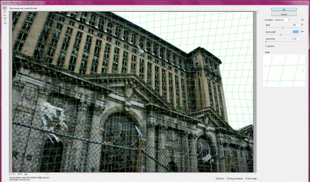
Another exciting tool is the Adaptive Wide Angle filter
The Adaptive Wide Angle filter is really one of those “oooh this is magic” things. You can adjust the very geometry of your images in an intuitive interface that puts perspective-based gridlines on your image. You can manipulate and drag angles and lines to correct wide-angle lens distortion (or go the opposite way and creatively fake wide-angle or fisheye distortion). The neatest thing about this filter is that it gives you a visual guide for the kind of stuff Photoshop has always done behind the scenes. You begin to see your images with “computer eyes”, as a rectangle filled with countless numbers, being manipulated in almost real time by your processor. Maybe I’m just too much of a nerd.
Since this is Icrontic, we have to talk about Mercury. Mercury and us, we go way back. Our original coverage of MPE back in Premier Pro CS5 laid the groundwork for two years of working with Mercury. Mercury is probably one of the most exciting technological innovations in any Adobe product ever.
A summary of Mercury is this: Our computers have both CPUs (processors) and GPUs (Graphics processors) in them. GPUs are really, really good at number crunching. That’s what they do. The only applications, historically, that have used GPUs to do any processing are video games. However, Adobe started accessing the GPUs in our computers starting with Creative Suite 4.
Mercury Graphics Engine speeds up some filters (most notably some blurs) quite a bit. It also speeds up the (really awesome) new Oil Paint filter. I ran this old photo of me and Jimmeh through the Oil Paint filter and got to see the effects in real time as I adjusted the sliders and settings:
The magic wand and quick selection tools are relatively unchanged from CS 5.5. The “Extract” filter is gone in favor of Quick Select and Refine Edge tools, which may bother some. It took me about 15 minutes to get used to the new method, and I see why they removed the Extract filter. It’s completely unnecessary.
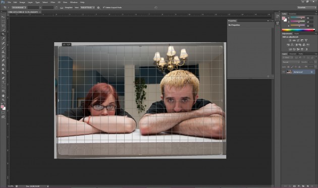
The new Crop tool is definitely worth mentioning because something as pedestrian as cropping has remained unchanged essentially since Photoshop 1.0. Adobe has been using the Customer Feedback tool that tracks mouse clicks and motion, and they found that the very first thing many people do when they open an image is immediately click the crop tool and then draw a square around the outer edges of the image. This time, when you click Crop, the square is there, with modern handles and sliders that show a grid and angles so that you can crop and straighten in one step.
As you can see from the official product page, there are a large number of new features, an improved interface, and of course the performance enhancements that come with Mercury. Is Photoshop CS6 worth upgrading to? Absolutely, yes.
InDesign CS6
For something like ten combined years of my adult working life, I used Adobe InDesign and its predecessor Pagemaker full-time in my career. That is to say, I know the product in and out, back and forth, and I’ve loved every single version of it.
That’s why it was strange for me to fire up InDesign CS6 for the first time. The interface was slightly different and many of the tools I was used to were either moved to different areas or removed. After being given a quick overview at the workshop, I realized why all the changes: This is a tool completely designed from the ground up to create tablet content.
That’s not to say that InDesign has suddenly stopped being a print layout application. Everything you’ve ever been able to do in InDesign is still there (and improved), but almost all the new features and changes to the interface are designed to make designing electronic documents easier and better for multiple screen layouts and sizes. You can have mixed page sizes in your documents, you can have liquid layout rules, alternate layouts depending on orientation (like when you turn a smartphone or tablet from portrait to landscape), and more.
Liquid Layout is the big deal for those who are designing for both print and electronic publication. This is going to be a lifesaver.
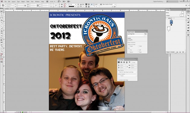
In this first screenshot, I’ve created a simple layout in a portrait orientation
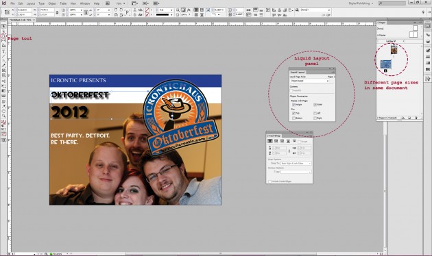
By duplicating the page, selecting the “object based” liquid layout rule, and dragging the corners of the new page with the Page tool, the entire layout shifts and moves around (just like it does in many modern web pages) live, adjusting your layout for a landscape orientation; again, for electronic magazines that are going to be viewed on tablets or smartphones, every single page has to now be designed twice, once for each way a user could be looking at it. If you are a professional layout or graphic designer, your workload just doubled.
Adobe’s 80%-of-the-way-there shows its face again; the automatic layout is not perfect, but man is it close. Close enough that it takes about 10 seconds to adjust things to get this:
This is a gigantic paradigm shift for InDesign, and as far as I know, this is the only application that makes this quick and easy for designers.
There are tons of other changes, but since Icrontic is not a professional designer hangout, you’ll be better served knowing that they are significant. InDesign CS6 is the most powerful version of InDesign I’ve ever used, and I’m just gonna call it a must-have upgrade for anyone working with electronic or print page layout.
Illustrator CS6
Illustrator CS6 is yet another major upgrade, with a few compelling new features and a lot of enhancements (including Mercury support for many effects). The new image tracing tools, in particular, are sorcery. Image tracing is the process of taking a bitmap image and converting it to a vector; something that’s been possible for years now—but not with this level of accuracy and simplicity.
There are new Mercury enhancements, and an amazing new pattern creation tool. You can also now apply gradients to strokes, which is something that has been sorely needed for years.
Premiere Pro CS6
Adobe is aiming to make Premiere Pro the most widely used professional video NLE out there. They are especially keen on converting disgruntled Final Cut Pro (the latest version has alienated many fans) users.
Premiere Pro’s trump card is, again, the complete and utter game changer that is Mercury Playback Engine. It’s such a phenomenal and marked performance difference that it’s pointless to get a system that is not Mercury capable if you’re a video editor. I know that’s a bold statement, but it’s absolutely a completely different experience going from non-Mercury-accelerated workflow to Mercury-enabled. In just one test, I had an 80% increase in performance by using an NVIDIA Quadro 5000M workstation GPU with Adobe Creative Suite CS 5.
Premiere Pro is the application that benefits most from Mercury. Almost every aspect of the normal workspace is accelerated by your GPU, from timeline scrubbing, to near-real or real-time effects rendering to final output and encoding.
For now, stick with NVIDIA
So if Mercury is so great and it affects so many aspects of Creative Suite, what’s the problem? Well,here’s the conundrum: We were hoping desperately that Mercury support on AMD Radeon or FirePro GPUs would be available in Adobe Creative Suite 6, especially since there are so many compelling FirePro products that are OpenCL compute monsters. Adobe says “they are!” but they’re not exactly exuberant in pronouncing that it’s only for a very specific configuration: Macbook Pro with AMD Radeon 6750M or 6770M. That’s it. No Windows support for Radeon or FirePro GPUs, and no other AMD models are supported. We wrote about this extensively, and that article explains why this is happening. Adobe is shifting their GPU compute codebase to OpenCL, but it’s a slow process. I spoke directly with Premiere Pro product manager Al Mooney, and he candidly and frankly told me that they want Mercury working on all OpenCL GPUs, period. There’s no conspiracy or NVIDIA contract preventing Adobe from doing this, it’s simply a resource and code issue. As they implement and test Mercury for other GPUs, they will roll support out in patches.
The bottom line right now is, though, that if you want to use Mercury (and most especially if you are using Premiere Pro CS6 or After Effects CS6), you will definitely want an NVIDIA Quadro GPU (here is our review for the Quadro FX 3800 and Quadro FX 6000, the fastest professional GPU we’ve ever tested).
It’s all about the cloud
Clearly, I’ve only touched the tip of the iceberg with Creative Suite 6. I haven’t mentioned Muse at all, or SpeedGrade, or the new Dreamweaver, After Effects, or Flash, but it’s only because I don’t consider myself qualified to talk about them in any sort of competent fashion.
However, one thing I can definitively say is that the Cloud subscription is the way you should be purchasing and accessing these tools.
Do the math: the Creative Cloud subscription is $50 a month. You get every single Adobe Creative Suite product, including the Cloud-only Muse and even Lightroom 4. You still get to download the full applications and use them normally. They still install like normal. They will work on Mac and PC. If you were to say “nay” to the subscription service and purchase a boxed copy of CS Master Collection, you’re up to $2600 right off the bat. Tack on $150 for Lightroom 4 and you’re up to $2750. It’s going to take you four and a half years for that purchase to be less than what it costs to subscribe. Do you honestly think you’ll be using Creative Suite 6 in four and a half years?
The “old” model is there for people who don’t understand the Cloud subscription or who are changeophobes. I have yet to hear a compelling argument as to why Creative Cloud is not the best way to get Adobe Creative Suite. I got into an actual argument with another reviewer at the workshop, and her reasons boiled down to ill-informed fears about “renting” software, and in the end her reason was a weak “I just like having the box on my shelf.”
That’s a hell of an expensive box, lady.
I said at the beginning that Cloud is something of a misnomer, and I stand by that. This is not actually a cloud service (well, the 20gb of online storage you get is actually cloud-based, so there’s that). It’s just a subscription that offers license keys for the normal downloadable full installers. You subscribe, you get your keys, you download the installers, and go create. Every 30 days or so, the software calls home to see if the license is still valid. If it is, you keep going. If not, it will deactivate in another 30 days and you can’t launch the software anymore. Nothing is “streamed” to you, and nothing is stored in the cloud (again, excepting anything you save on your Creative Cloud storage plan).
Right now, if you’re a current CS3 or newer owner, you can get your first year of Creative Cloud for $29.99 a month. Since most people who care about CS6 already own a previous version, this is a fantastic deal. Those people who are still stuck on CS3 or CS4 finally have a chance to upgrade to the latest and best version of Creative Suite for dirt cheap.
I could go on and on about the vision and scope that CS6 encompasses. It’s a tremendously ambitious software package that deserves far more content than I can ever write about it. I’ll end it with this: Adobe Creative Suite 6 is the best version of Creative Suite I’ve ever used. If I was writing this without the Creative Cloud existing, I would say that it is probably not an amazingly compelling upgrade for users of CS5.5 unless they were publishing electronic magazines. However, with Creative Cloud factored in, there is absolutely no excuse not to have the best design software on the planet. Adobe CS6 is that software.


 Articles RSS